Monday, May 24, 2010

Blog #5


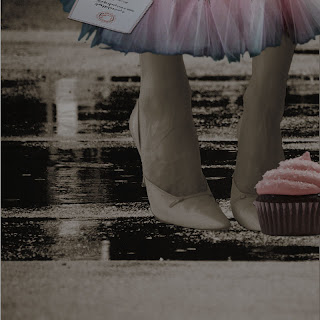
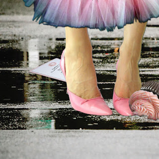
1.) My most significant accomplishment in my midterm is my ability to make all my objects look more realistic after they were cut and pasted into the new background. I made sure I learned how to properly use, the magnetic lasso, blur tool, smudge tool and attempted to perfect with the feathering tool. I was extremely proud of my Diptch pieces and how they turned out. I was also proud of my Big Idea in these pieces because I felt that I displayed a true sense of emotion through color. Even though one image had sad events, such as the cupcake falling and the invitation in the puddle, it still was the "Happier" image because of the brighter colors. I truly enjoyed creating my midterm and combining all of my new learned techniques.

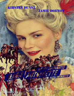
2.) Creating masks was a very hard task for me to learn, but I finished the quarter feeling way more successful than I ever imagined I could have, especially when I created my work for Quiz number four. I was extremely happy with the mask that I created for this quiz. I felt that my Hue/Saturation mask perfectly created the "masculine" feel I was trying to achieve. I took a very "girly" Marie Antoinette movie poster and created a much more "manly" look using different colors and pictures that I coordinated together using one mask. Learning how to create this mask was difficult, but well worth the effort.

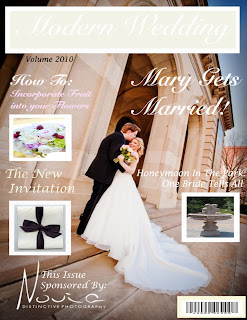
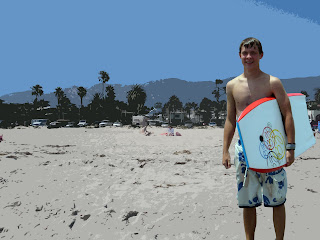
3.) For quiz number two I attempted to create a "Hollywood movie poster" look using simple Photoshop techniques and at the time, I felt that I did a pretty good considering that I had never used Photoshop prior to this class. Even though It may not have been a very good piece of work compared to others, it certainly was better than my first quiz where I created a flat wedding magazine cover that had even less meaning than my quiz number two. It had no masks, no color changes and no adjustments, it was simply cut and pasted text and pictures, as opposed to the beach that had been adjusted to create a new, almost glamourous California beach scene. Both quizzes taught me valuable techniques, but the second definitely had more meaning.

Blog #4


My Big Idea is how emotions are affected by color, particularly in what colors we wear. I wanted to explore whether emotions determine what we wear or if what we wear, determines our emotions. I am attempting to create more in-depth feeling and emotion into day to day fashion. I wanted to start off at a young age, where people can't necessarily choose what they are wearing, instead their parents are dressing them. Next, I wanted to move into an older age, where fashion is a dominant part of life and truly determine what causes us to wear what we wear and how those choices affect our feelings. Some visual strategies that I employ are color, age, background, masks and light. The image communicates my meaning by its consistent use of color in relation to the accompanying emotions, happy feelings with bright colors. These images can be used as fashion advertisements for a number of companies or even used to help aid in color therapy sessions.

Three artists that have had an impact on my work are, Andy Warhol, Kate Spade and Henri Matisse. These artists influenced me because color is a huge part of their work, as well as fashion. These artists have all dared to be different in their own pop culture way, which is also very inspiring to me.

One new Photoshop technique that I plan on using is more in depth masks. I want to really explore how I can change light, shadows and colors.

Monday, May 17, 2010

Quiz #4 Movie Poster Compare and Contrast


Movie Posters are a great example of gender targeting in the media, especially today. The Marie Antoinette movie poster is clearly targeted towards a female audience, while the Braveheart poster is obviously geared towards a male crowd. One reason Marie Antoinette can be considered a “Chick Flick” is based on the color used in the poster. The colors gravitate towards lighter colors, such as pastels and creams, as opposed to the “Guy Pick” heavier colors in the Braveheart poster, such as the dark browns. Other aspects of the posters that create a feminie or masculine “look” are through the clothing. In the Marie Antoinette Poster, Kirsten Dunst appears to be carrying a fan, there is a pink feather in her hair, and she is wearing a decadent couture gown, all speak greater to women. In the Braveheart poster Mel Gibson is wearing a battle uniform and carrying a sword, all speak louder to men. The backgrounds of the posters also provide gender targeted elements, such as the luxurious silk in the Marie Antoinette poster and the war in the background of the Braveheart poster. Along with the more subtle reasons are the more obvious ones. Some obvious reasons why Marie Antoinette is being targeted to women is the fact that they only feature one woman on the poster and the movie title is just a female name. Similar, is the fact that in the Braveheart poster Mel Gibson is the primary focus. Many posters, games and even T.V. shows follow similar techniques.

Blog #3


My Big Idea is emotion with underlying themes of color and fashion!

The first artist, Andy Warhol greatly appeals to me because he uses color as a main focus in all his pieces and that is my big idea, color through emotion. I love that he takes everyday items and household names and turns them into his own creations of art, all by changing the colors. I find it inspiring that he can completely change the mood and emotions of an object, such as Marilyn Monroe's face all by changing the color to a "happier" or " sadder"one, like how he chose pink or blue tones. Some of Warhol's stylists components that I would love to incorporate into my design are how he lets all the different color layers remain visible throughout a single image.

The second artist, Kate Spade also greatly appeals to me because she also uses a huge amount of color to influence the mood of her art, which is also part of my main idea, color and emotion through fashion. I enjoy that she uses normally sad times, such as rainy weather to lay the foundation for a "happy" outfit with bright positive colors. I find it inspiring that although she uses very colorful materials, she almost always has a very plain, white background for her advertisements. I would love to incorporate her streamlined look of bright colors with plain back drops into my final project.

Overall, I love both artist's use of color and stylist designs and am looking forward to incorporating it all into my last piece.

Wednesday, May 12, 2010

Midterm Diptych


My Big Idea is emotion and my themes are color and fashion. I explored my Big Idea by watching people and observing their emotions in relation to what they’re wearing, in addition to learning colorful Photoshop techniques. Some visual cues I used are bright (Happy) colors in my left image to convey positive emotions and I used the opposite, darker (Sad) colors in my second image to express negative emotions. One strategy I used is, even though in my left image the girl has dropped both her cupcake and party invitation, it is still a more pleasant picture than the right image, despite the fact that she hasn’t dropped her things because the overcast of colors is happier. The Big Idea is important to me because I want to be a fashion designer after graduation and learning why people wear the clothes they do could help me better my designs and color choices.

Blog#1 Re-Post (It didn't Post the First Time?)


The first image on the left;
Connotations: The picture is happy and "bubbly" almost celebratory because of the balloons, confetti, bright bold colors and high energy. This possibly an image of a party after the end of WW2 or even a birthday party based on the style the girls are pictured in (1950's).
Denotations: There are three girls (1950's pin ups), bright bold colors. The letters N,Y, O and E are in the background. A speaker box is shown with balloons, a smaller girl holding balloons, streamers, confetti, noise makers and kites.

The second image on the left;
Connotations: The picture is more somber because of the "Black Beauty" like horse figure and darker colors that are present. This image appears to focus more on animals and african type prints, such as the zebra and geometric styles.
Denotations: The main color is black with a little yellow. There is a horse, a birds beak and patterns.

http://www.beautifuldecay.com/

Monday, May 3, 2010

Blog #2


Link to the Honey Tutorial: http://fx.worth1000.com/tutorials/161268/161268-creating-honey-covered-objects

The tutorial was originally designed to create honey, but I wanted to change it to a strawberry syrup. I started out with a vanilla ice cream cone and ended with a strawberry ice cream cone covered in strawberry syrup. The first steps involved choosing the color balance that I wanted and selecting the areas that I wanted to be covered in the syrup. I enjoyed learning how to select with the magnetic lasso and saving selections individually. Next I blurred, highlighted and smudged the image for where the syrup was to go. Next I filled the merged selections with a deep magenta color, highlighted, burned and detailed the syrup. I had difficulty creating bubbles, so I eliminated them since I felt they didn't have a huge place in a thick strawberry syrup. Finally, I smudged and burned the new colors until I reached my final product! I actually really enjoyed learning this technique!